Differences in Japanese Design: Online Hotel Platforms
If you've ever seen a Japanese website or application before, you may have noticed some striking differences from what you're used to seeing. While much of the world's digital space has been normalized by standard design principles, for better or worse Japan has stayed the course on its own path. This series will take a look at some of the many differences between Japanese and standard global design.
While most modern websites have adopted the principle of "less is more", many Japanese websites still appear to be be plagued with information overload. One of the often cited reasons for this is that Japanese consumers prefer being able to see as much information as possible. The more information present, the more comfortable the users feel.
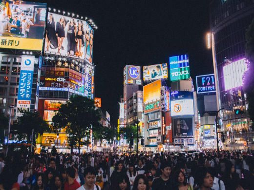
While this is probably an overgeneralization, information clutter isn't going anywhere anytime soon. Perhaps this is because it's not just something that exists on the web. It's a principle of everyday life in Japan. Take the Greater Tokyo Area for example, the most populated metropolitan area in the world, where an estimated 37 million people jam into tight quarters and file down narrow alleyways that often zigzag off into unexpected directions. Hundreds of thousands of restaurants and shops compete for attention, their neon signs floating in a sea of electric haze. Sprawling train tracks crisscross and overlap in a vast, city-wide network of connectivity. Legions of commuters pack into train cars, where innumerable advertisements line the walls and ceilings - their tiny yet beautiful kanji characters seemingly both endless and directionless.
It's so much information that you feel almost smacked in the face. You wonder how passersby could pay attention to any of it at all, let alone differentiate one source from another. There's a similar sensation the first time you use a Japanese website (or at least there was for me). It's difficult to know where to start. But eventually, you acclimate and the chaos begins to make a whole lot more sense.
As an outsider, it's easy to be dismissive about local design when creating digital content for Japan. Using global trends as a benchmark, it would be difficult to perceive this local design as a good thing.
But I don't want to argue whether or not Japan's often cluttered design is a good or bad thing. Instead, I think it's better to understand that just by being dismissive you can alienate yourself from a large number of users. Rather than approaching the issue with criticism, is it not better to step back and understand it's purpose or why locals find it acceptable in the first place?
In the first post of this series, I'd like to take a look at online travel platforms, specifically focusing on how Japanese domestic companies such as Jalan, Rakuten Travel, Ikkyu, and Yahoo Travel differ from globally present companies like Expedia, Agoda, Booking.com, and Airbnb.
One of the digital trends among multinational companies like those listed above is to use global template designs for their websites. This means that their sites use a design structure that is similar across all countries and content that is often duplicated. While this can be an effective strategy for curbing costs on country-specific redesigns, is it the best choice when considering Japan?
Local Vs. Global Templates
As multinational online travel platforms need their sites translated into multiple languages, it's easy to imagine the benefit these companies see in consistency across cultures. In fact, both Airbnb and Agoda use the same design template across all countries with identical content. Whether I browse in English or Japanese, I should get exactly the same experience from the landing page to checkout.
On the other hand, while Expedia and Booking.com use the same basic template, they modify some of the Japanese content. I'd still basically have the same experience searching in Japanese or English, but creating at least some culture specific content can be appealing to local users, especially for those loyal to domestic sites.
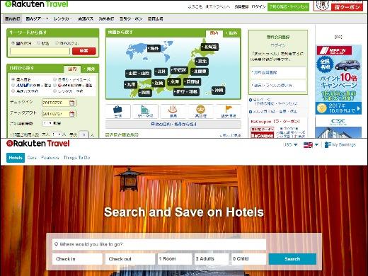
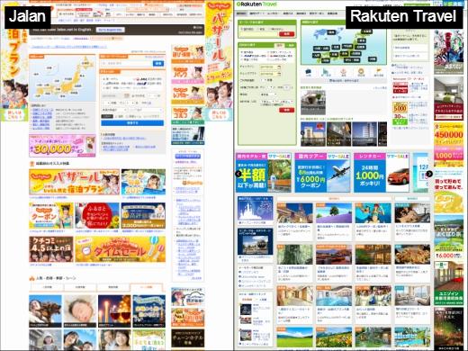
Japanese domestic hotel platforms such as Jalan and Rakuten Travel offer stark contrasts compared to international sites. Most foreigners would immediately notice the information overload and clutter. They would see limited white space and probably have difficulty in directing their attention to anything in particular. The site would feel almost disjointed when compared to the fluid design they are used to.
Neither company seems to be unaware of this, as they both have global pages that adhere to international principles. These global pages function as completely different sites rather than extensions of their Japanese content, becasue they have been designed with a specific focus on foreign tourists traveling to Japan. The development of these foreigner-focused sites is likely due to the growth of Japan's tourism industry. According to the Japanese National Tourism Organization, from 2010 to 2016 foreign visitors to Japan rose by around 179% to 24 million and this number is expected continue to increase as the 2020 Olympics approaches.
It's All About the Maps ... And the Promotions
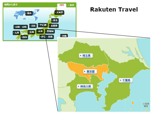
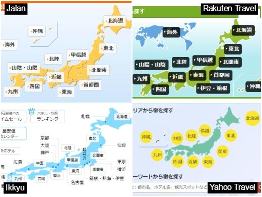
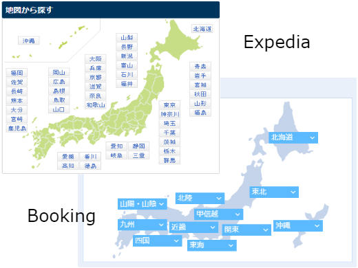
Probably the most salient feature of Japanese domestic online hotel platforms is the use of an interactive map on their landing pages. These maps offer users an alternative method of searching for hotels. Rather than simply typing a desired location into a search bar (although this is still an option) users can click on a multi-layered map of the country. The first layer consists of several large regions that direct users to one of the 47 prefectures and from there they can select specific areas within the prefecture. Each of the major domestic websites has a variation of this map.
Interestingly, Booking.com uses a similar map on their Japanese landing page and it seems to be the only content modification made to any of their global sites. Expedia also includes a similar map of it's Japanese websites, but only on a specialized page designed for those wishing to stay in a Ryokan (which is a traditional Japanese accommodation)
Another mark of Japanese domestic travel platforms (and many websites in general) is the amount of promotional content. For Jalan, Rakuten Travel, and Yahoo Travel in particular, you'll find that much of the page is dedicated to various promotional content. The content generally includes package deals with food and travel included in the cost (which is particularly popular for establishments such as Ryokan).
Discounts or coupons are offered for traveling to specific locations and seasonal deals are promoted, especially during autumn's changing of the leaves and spring's cherry blossom season. There's also curated content, such as a dedicated page for travelers over the age of 50, those traveling with pets, or those traveling for anniversaries. You'll find that Expedia's Japanese website includes localized promotions similar to the ones on domestic sites as well as a specialized Ryokan page and travel necessities page.
Inclusion of localized content can perhaps act as an olive branch to Japanese users who, as we have mentioned in the past, have a tendency toward risk aversion. It's much easier for users to make a leap from already trusted brands to new ones if the gap between them is reduced.
Conclusion
While clutter on Japanese online travel platforms might scare off western audiences, especially given our preference for minimalistic design, it's nevertheless a popular character of these websites in Japan. Whether or not international organizations want to to embrace them or not, it's important not to disregard them entirely, because at least for now they appear to be what users largely prefer. To disregard the user's preference is to disregard the user. So the important thing, as always, is to understand your user base through dedicated and consistent research. Validating concepts and testing designs with real users is the only way to be sure of what will be deemed acceptable or not.
If you'd like to dicuss this topic or just UX or Japan in general, you can reach out to me at jonathan-weeks@mitsue.co.jp