Cross-Cultural Design in Japan & Colombia
UX Intern - Paula ValenciaWhen talking about UI and UX design it's really important to consider who your audience is going to be and what their wants and needs are. One interesting point to also consider, especially when designing a global product for users from different countries is culture.
My name is Paula Valencia and I am an Interactive Media Design student from Colombia. Currently, I am doing an internship at Mitsue-Links to learn about UX design differences between Japan and my home country.
During my first month here, I have realized just how different user interfaces can be between countries. For example, while comparing websites in Japan to those from Colombia, I discovered Japanese websites use a lot of colors and contain a lot of detailed information.
Personally, this was confusing to me as I am more used to using clean, minimalist web designs. I wanted to understand more about this difference and how it might affect businesses and their design decisions.
To better understand what factors - cultural or otherwise - make user needs unique across countries, I'll briefly look at 3 features of UX/UI design that differ between Japan and Colombia.
Emotional Engagement
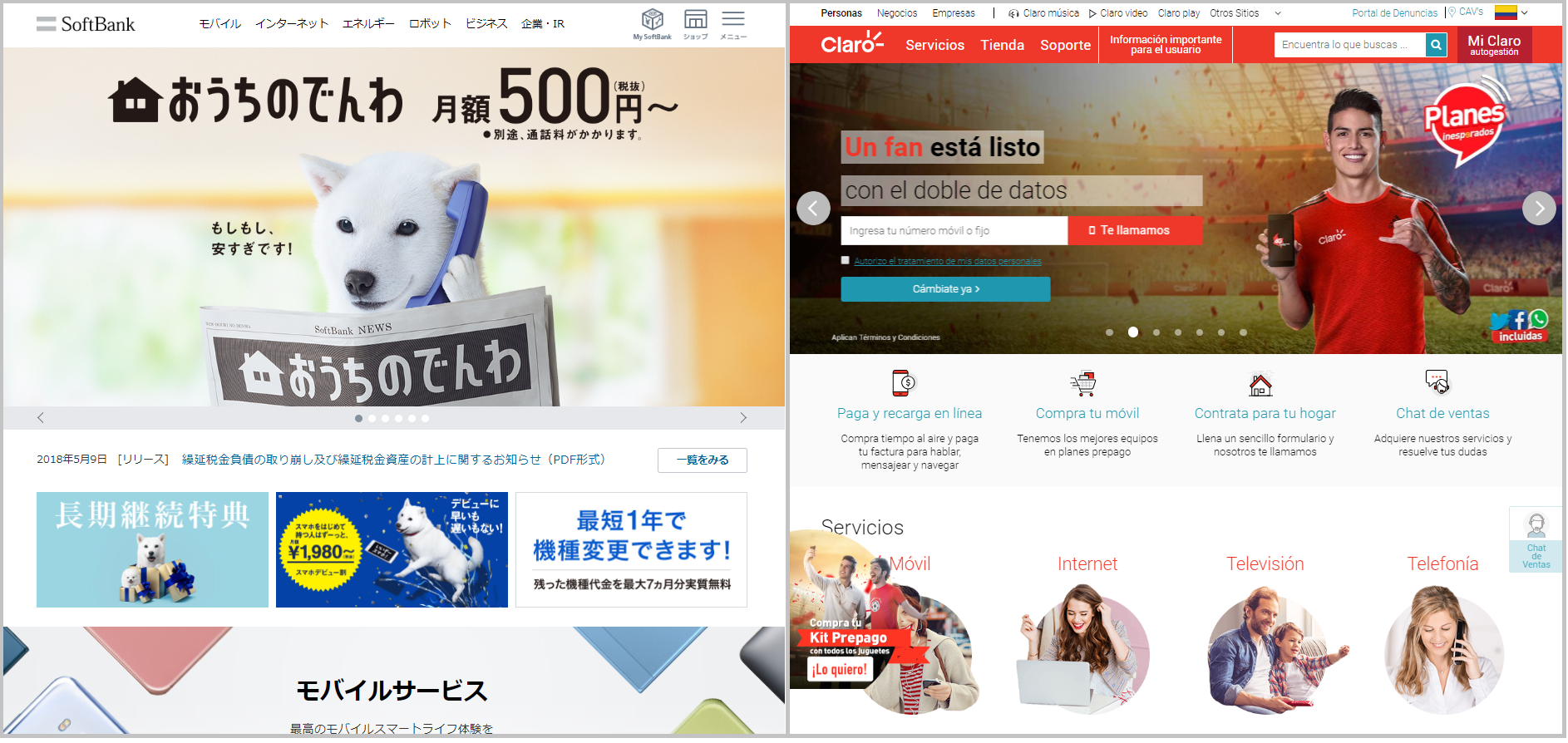
Brands attempt to produce emotional engagement through design to create valuable connections that resonate with their user bases. But how does culture play a part in defining what is valuable? Between Japan and Colombia, one of the interesting differences I have noticed so far is Japan's use of mascots or cartoonish characters to represent their brand image.
As an example, Japanese telecommunications giant Softbank often personifies the iconic Hokkaido dog breed, ainu. The dog, and other cartoonish characters common in Japan, are often used to convey cuteness, innocence, and friendliness. But characters such as these may not have the same effect on Colombians, who might perceive them as childish. In contrast to Softbank, the Colombian telecommunications company Claro utilizes people in real-life situations as well as popular celebrities such as football player James Rodriguez, seen in the banner.

Aesthetic Appeal
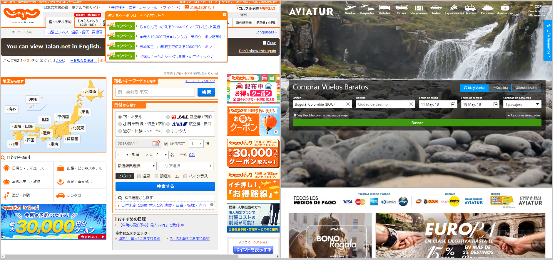
In Japan, designs often seem to make use of vertical columns or content areas with a variety of colors and images. Also, marketing content, such as discounts and package deals seem to be overtly displayed in abundance. Colombian style, on the other hand, mirrors the visual aesthetic of Europe and the United States. Websites often employ row-based content areas and a minimalist design.
To illustrate, there is a very noticeable difference between Colombian booking platform, Aviatur, and the Japanese equivalent, Jalan. On Jalan, we can see large white margins on the sides, an extremely detailed navigation bar, and a complex search tool. There are also many bright, vivid colours used throughout the site to draw user attention to content. In contrast, on Aviatur the banner image stretches all the way across the page, the navigation bar is less crowded, and the search tool is simpler. The use of color is also more subtle and limited compared to the Japanese site.

Information Appropriacy
The amount and type of information within a website or app can often be a marker for credibility. If users are not accustomed to the volume of text content displayed on the page, they can form negative impressions. For example, during a recent user testing session I observed for a finance-related website, a participant commented that there was too little information on the homepage. Although the site had simple visuals and was pleasant to look at, the lack of detailed explanations caused this participant to mistrust the site. He was used to finance-related websites having a lot of text, so being shown a homepage with sparse content made him associate the page with popup scam pages.
This participant's comments surprised me, especially since I recently had the opposite experience. Before moving to Japan, I had been looking for a place to live using some Japanese websites. My first impressions navigating these sites was that Japanese web design seemed to favor extremely crowded layouts compared to Colombian sites. Interestingly, because of the overwhelming amount of content, a friend of mine who was helping me search for accommodation on the Japanese pages, was concerned that these websites might be fake.
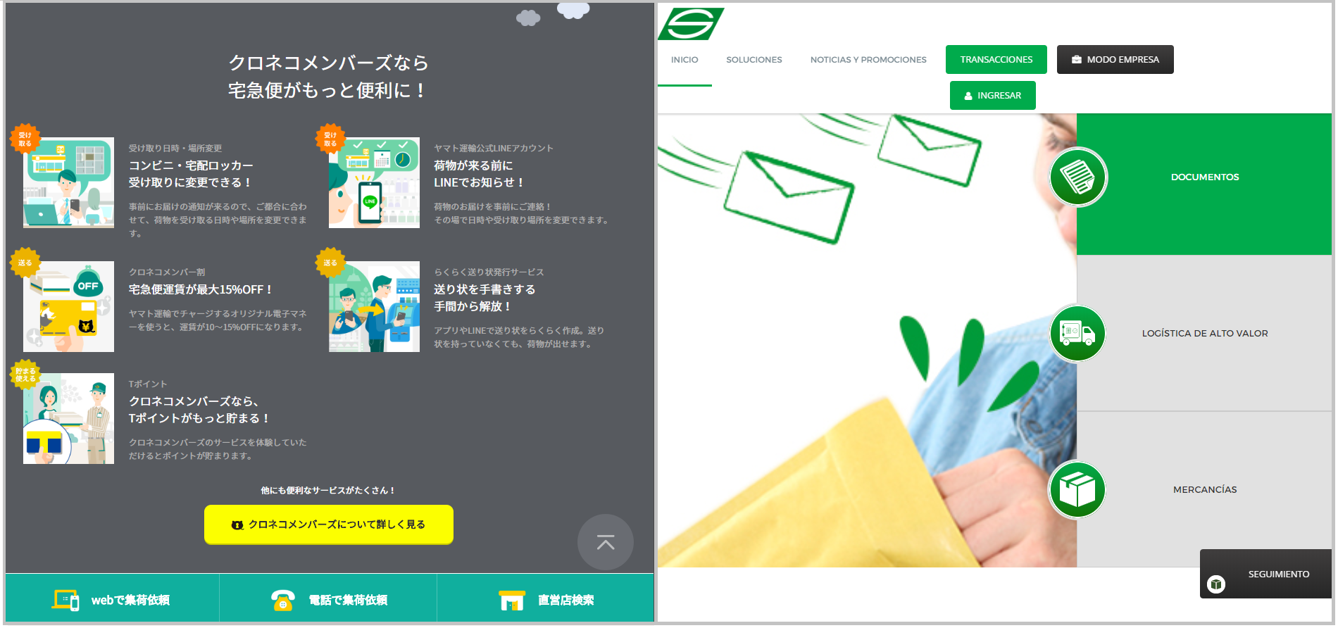
To illustrate how different the volume of information displayed on Japanese and Colombian websites are, below is a screencap of the transport companies Servientrega from Colombia and Yamato Transport from Japan. Yamato's homepage includes far more detail regarding its services than does Servientrega. Of course, Servientrega also has detailed information about its services, but in order to view this information users must click deeper into the site.

To conclude, the below is a summary of the web design differences I have observed while watching user tests and interacting with various Japanese websites similar to the above.
- Emotional engagement on Japanese websites is often created via the use of cute, cartoonish mascot characters. These characters are associated with company brands and help to convey a sense of friendliness and approachability. In contrast, Colombians prefer to use photos of people to create the same favorable website impressions.
- Japanese websites tend to use a lot of bright, vivid colors. This is especially true when a company wants to advertise special campaigns or package deals. While non-Japanese users who are unfamiliar with the Japan market may be overwhelmed by such colorful designs, Japanese people seem to be used to visually complex web pages.
- Japanese are accustomed to using text-heavy websites. One of the reasons for this is because users prefer seeing detailed information upfront, as text volume helps create a sense of trust and credibility. This contrasts with users in Colombia who prefer websites - especially the homepage - to have simple information content. Colombians do not mind needing to dig deeper into the site to retrieve desired content.
