Reporting on UXPA2019: How to connect usability testing to design, Part 1
How to connect usability test results to design
My column about participating in UXPA 2019, a user experience themed conference held June 24-27 in Scottsdale, Arizona, has now been posted. For content I couldn't share there, I will share here and in subsequent posts. Initially, I'll discuss my conference presentation.
About the poster session format
At the UXPA conference, in addition to lectures, there was a poster presentation session. For the poster session, speakers arranged their posters in a designated room and then, during a specified 1-hour time slot, had dynamic discussions about their work with their audiences. Including mine, there were 14 posters presented at this year's conference.
The theme of my presentation
My presentation was titled "how to bridge the gap between usability testing and design - avoiding misguided solutions to problems."
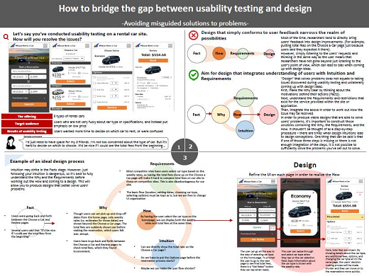
As interest in UX continues to grow, it seems that the idea of delivering the optimal web design to users is becoming more widespread. Recently, it has increasingly become the norm to pinpoint problems by having users trial the website during testing phases as part of the improvement process.
However, even if such usability testing is performed, I've often heard that ascertained problems aren't resolved in the final design. So, what gives?
The tendency to bring user input directly into design
Through usability testing, target users provide lots of feedback, which then serves as suggestions for improvement. User researchers do not directly incorporate these comments into design. Instead, they first look through the observations ("facts"). They then think about reasons users took specific actions and made certain comments (the "why") before moving on to identifying problems. However, in cases where no experts in usability are observing the tests, product owners tend to more rigidly follow the user feedback.
As an example, I'll discuss the mock car rental site that I included in my poster. The user selects desired rental dates and location, after which they choose the vehicle model, any optional extras, and then proceed to make the reservation. The total price is shown on the confirmation screen. However, during usability testing many users appeared at a loss because they wanted to select the car model after learning the total price. Consequently, they had to repeatedly move back-and-forth between the reservation confirmation and car model selection screens to do so.
One user said, "it would be nice if I could see the total price from the beginning".
Being feedback from an actual user, this statement is extremely powerful and may be taken directly as something to be improved on. From this statement, it's easy to suggest putting the total price on the screen after the user selects rental dates and location as a fix.
However, if it's not possible to show the total prices upfront due to system requirements and/or business strategy, the discussion reaches a standoff. Even if it is possible, simply listening to the user's request means only thinking in the same way as the user. By doing so, the research team hasn't gone beyond understanding issues from the user's perspective, which can narrow the field in terms of design solutions.
Determining the reasons behind users' actions (the "why") by asking questions such as "why did the user have dissatisfaction regarding total price?" and "for actions that other users took but didn't explain in detail, why did they take such actions?", can help keep options open.
I'll explain how to better employ user feedback to make design improvements in my next UX Blog.